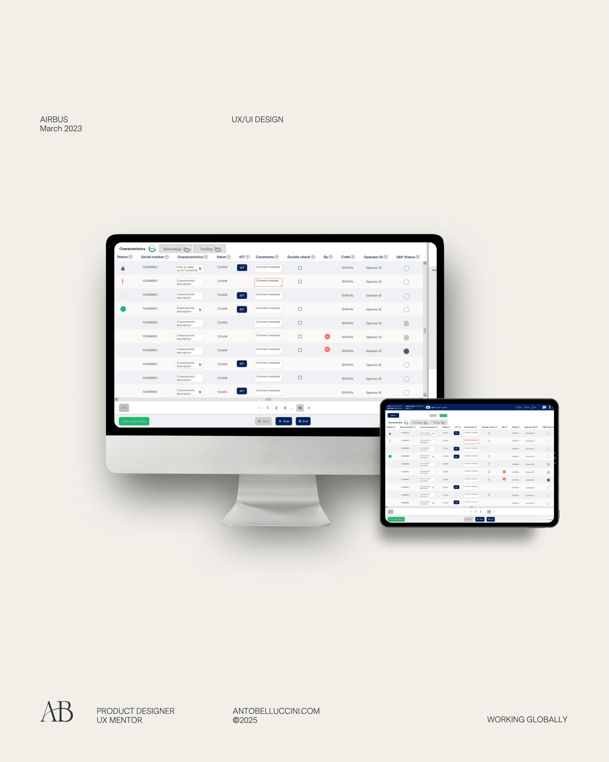
Structuring Quartz DS for scalability and adoption
UX Research & Community lead
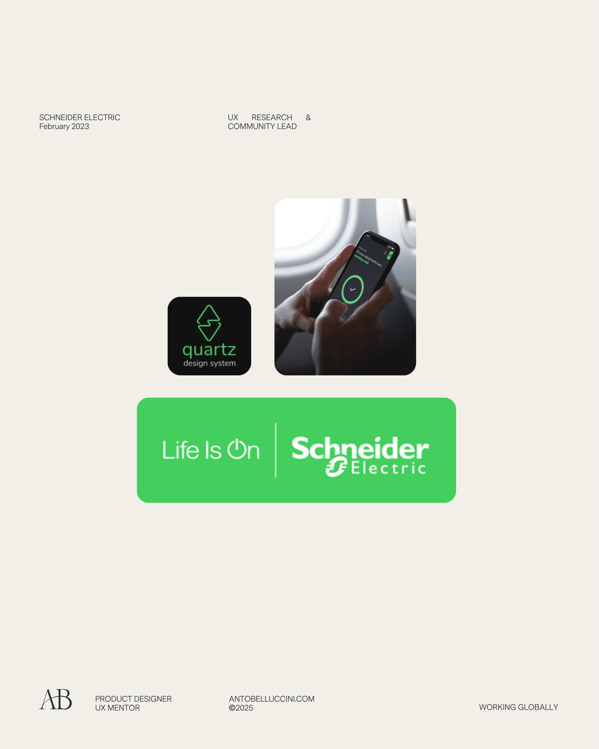
Project Overview
February 2023 — July 2023
💼 Corporate / Energy sector | 🛠️ Design System and Documentation
Mission:
Help build and document the Quartz Design System for Schneider Electric France, defining UX content structure, governance, and accessibility best practices to improve adoption and quality of the DS across teams.
👉🏼 The problem
Schneider Electric’s Quartz Design System, built in France, was already used across several teams but lacked:
Clear, consistent documentation for contributors.
Aligned naming conventions across platforms.
Strong accessibility standards in component usage.
A well-defined voice and content hierarchy in the Design System.
Community governance and contribution guidelines.
As a result, teams struggled with:
Inconsistent component usage.
Lack of clarity on how to contribute.
Disconnected collaboration between designers and developers.
Poor onboarding for new DS users.
🎯 Objectives
🖥 Interface Objectives
Define clear content structure and hierarchy for the Design System documentation.
Establish content principles to ensure clarity, consistency, and usability.
Support accessibility through documentation and UI guidance.
Help make the Quartz DS a tool that is approachable, clear, and efficient for designers and developers.
Provide accurate, updated UI component documentation (Figma + Markdown + GitHub).
💼 Business Objectives
Increase team awareness and adoption of the Quartz Design System.
Provide a solid foundation for new teams and contributors.
Improve efficiency and consistency across Schneider's digital products.
Enhance Schneider Electric’s design maturity at an organizational level.
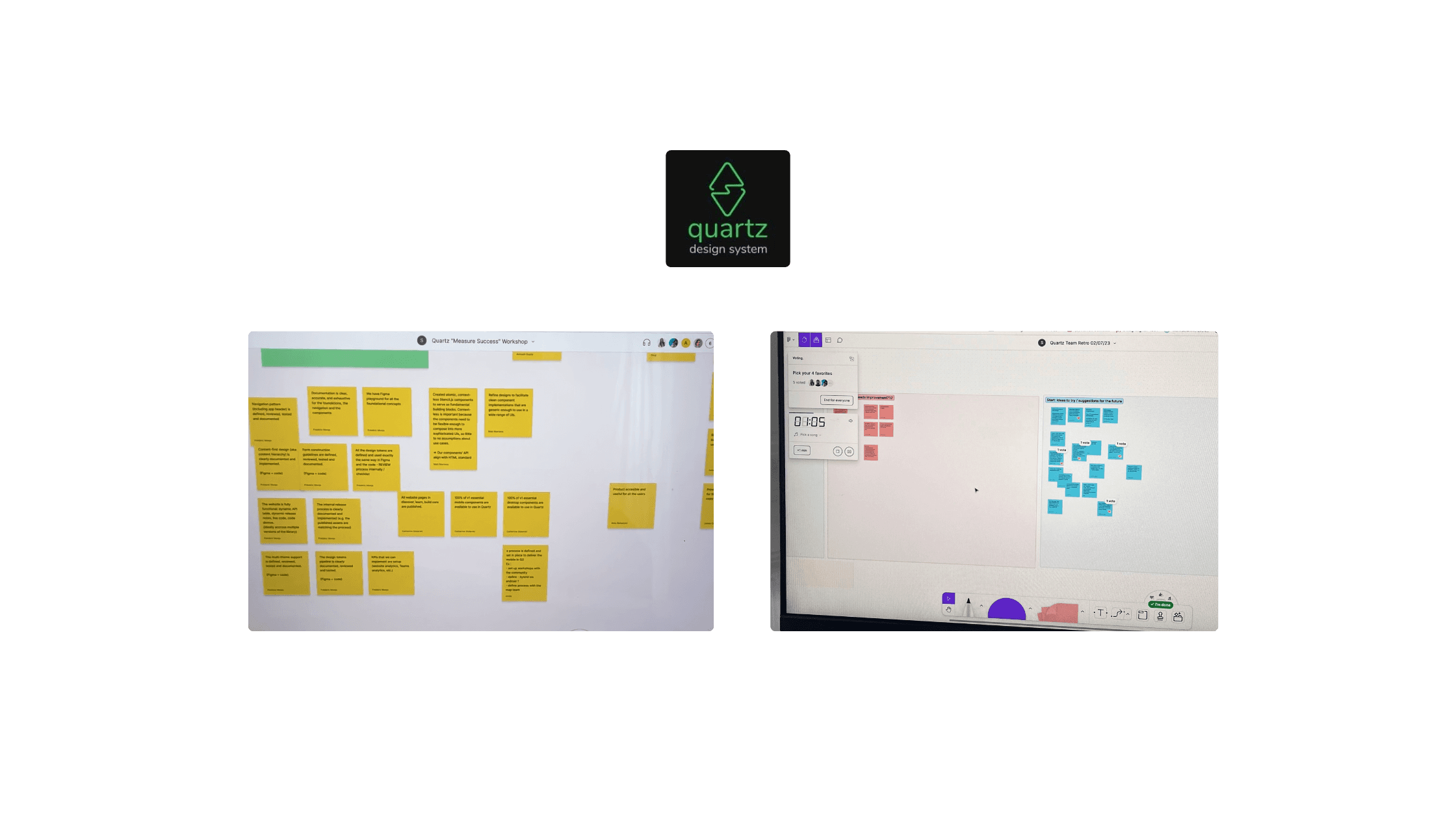
Methodology
📝 Onboarding & Research
Understood the Quartz Design System’s current state, challenges, and team objectives.
Reviewed existing documentation, community feedback, and Figma libraries.
Conducted research on best practices for Design System content, governance, and accessibility.
🔎 Content-first Strategy & UX Structuring
Applied a content-first approach to ensure documentation clarity, hierarchy, and usability before visual adjustments.
Established component naming conventions (platform, theme, version).
♿ Accessibility Integration
Integrated accessibility checks into the documentation workflow for each component.
Documented ARIA roles, contrast requirements, and component states to ensure compliance and usability.
🤝 Community Engagement & Governance
Led community syncs and workshops to foster adoption and share best practices.
Supported alignment across design and development teams through collaborative discussions.
🚀 Validation & Delivery
Iteratively validated content hierarchy, component documentation, and governance model with the core team (Head of Design, PM, Dev).
Delivered final documentation updates.
Ensured alignment between design, development, and community practices for Quartz DS.
🗂️ Key Contributions
Defined content hierarchy and structure for component documentation across the Quartz Design System.
Wrote and validated naming conventions for components, adapted to platform, theme, and version (3 dimensions).
Created and documented component guidelines (buttons, checkboxes, templates) with accessibility best practices.
Structured Playground content to ensure clear examples and usage clarity for designers and developers.
Produced Markdown templates and guidelines to standardize writing across the documentation site.
Drafted and refined governance guidelines: branching strategy, release process, and contribution rules.
Led community onboarding sessions and created internal communication materials to promote adoption.
Facilitated cross-team alignment on documentation and DS usage through workshops and community meetings.
🧑💻 Use Cases
As a designer, I want to easily find UI components and usage guidelines.
As a developer, I want clear, consistent documentation to integrate DS components.
As a new team member, I want to understand the content principles of the DS quickly.
As a contributor, I want clear naming conventions and governance rules.
As a team, we want to align on the same accessibility standards.
🎨 UX Outcomes
Validated content hierarchy and navigation for the Design System documentation.
Defined and documented component naming conventions across platforms and themes.
Produced and validated component guidelines with embedded accessibility standards (ARIA, contrast, states).
Structured and implemented Playground content to support real-world usage of components.
Created Markdown templates to ensure consistent and scalable documentation writing.
Defined and communicated governance model for contribution, versioning, and GitHub branch management.
Integrated accessibility checks and reviews into the documentation workflow for each component
Facilitated community onboarding through workshops and sync meetings.
Aligned design and development teams on best practices for Design System adoption.
Improved UX maturity and design consistency across teams through enhanced documentation practices.

Final Result
While the Quartz Design System v1 was not fully launched due to internal leadership decisions, the project delivered substantial value to the organization:
✅ A validated and scalable content hierarchy for the Design System documentation.
✅ Integrated accessibility standards and documented best practices for components.
✅ A unified naming convention and documentation structure ready for cross-team use.
✅ Onboarding materials and community workshops that strengthened DS adoption and UX maturity.
The work completed contributed significantly to improving team alignment, content quality, and design consistency across Schneider Electric’s design community and positioned the DS for future scalability.